
PROJECT_REF:
[bg_8080 // black_n_gold_id]
brand identity system for off-market luxury real estate. gcc and european markets.
SYSTEM CONTEXT
Black N Gold starts with a question most designers never ask: if there is no building, no office, no storefront — what is the brand made of?
For an off-market luxury real estate agency operating between GCC and European markets, the answer was precise: the brand exists exclusively through its materials. Which means the materials cannot afford to be decorative. They have to carry the entire weight of perception.
This is where Brand Experience Design begins — not with aesthetics, but with the question of what a space, an object, or a surface needs to make someone feel before a single word is spoken.
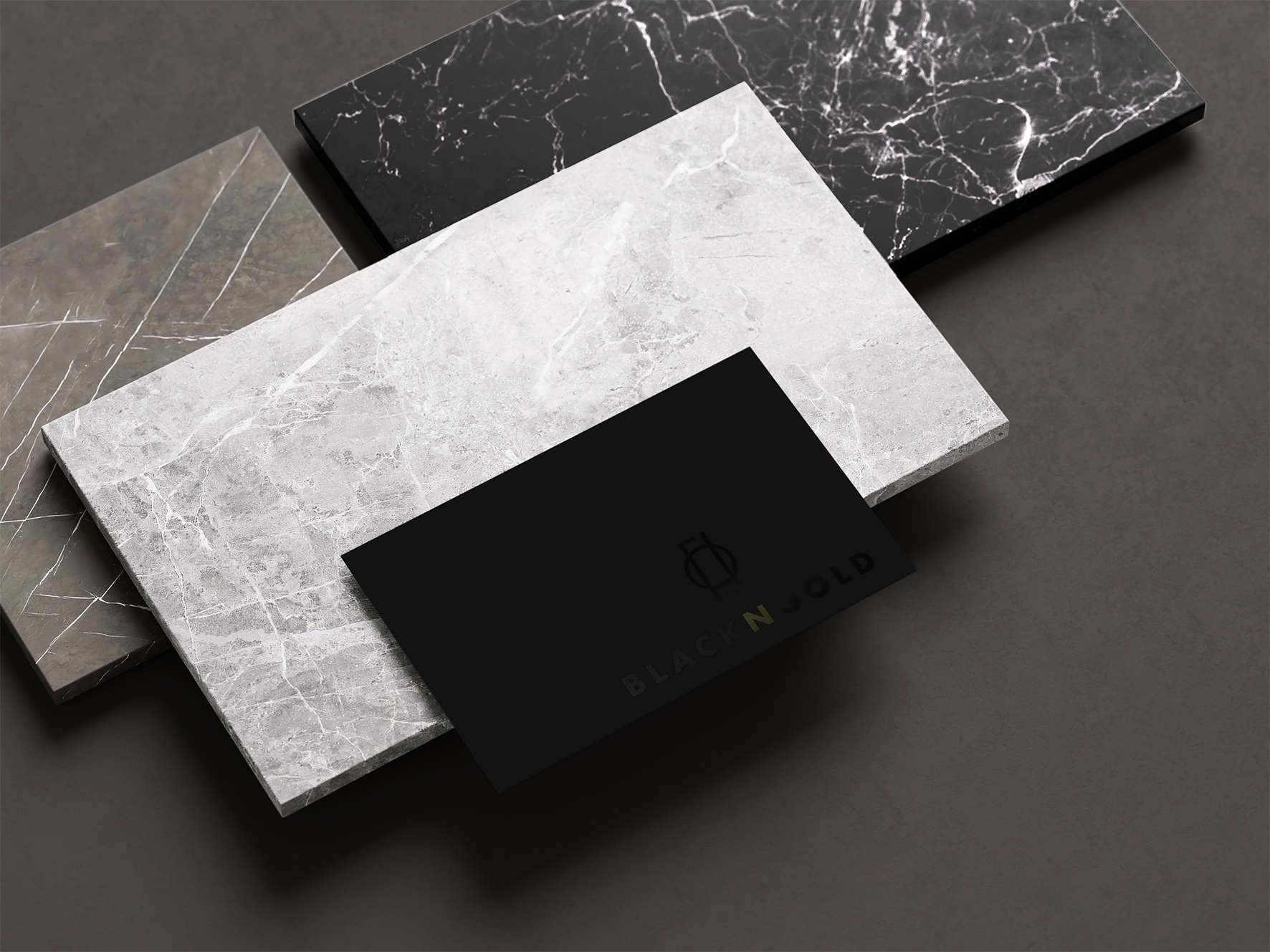
Every decision was made to engineer a specific emotional response: cold authority. The logo fuses two mirrored forms into a single resolved circle. The wordmark is Futura, letterspaced wide — geometric, unhurried, certain. A single note of cold olive gold appears once, in the N. Not as decoration. As a signal.
The palette never warms up. It never decorates. It governs.
luxury real estate — off-market networks — investors
When there is no physical space to walk into, the brand material becomes the space.